

The collapsing turnout of Democratic men
A warning for the party from the 2024 voter file data

The ground truth of electoral analysis is the voter file. We obsess over county and precinct results, since these are readily available in the days and weeks after the election, but individual vote history data recently made available can be more revealing about which demographic groups were motivated to vote.
The story told by the county data in the wake of the election painted a dismal picture for Democrats. Turnout was down compared to 2020 in blue areas while it surged in red areas, though this gap was more muted in battleground states. Individual vote history doesn’t debunk this, but it also shows that this largely was baked in going into the election cycle. Republican gains in voter registration and population growth in red states made it so that Republicans entered the 2024 election in a stronger position. On Election Day 2024, Republicans finally got to flex those muscles, resulting in the party’s first popular vote victory in 20 years.
This baseline expectation is calculated via a probabilistic turnout model, scoring each voter from 0 to 1 on their likelihood to vote, based on their past turnout and demographics. These scores can then be compared to the vote history from the 2024 election. The differences between the two sets of figures can then tell us how the campaign itself affected turnout on both sides.
By this measure, Democrats could have certainly done worse. They started out in a weaker position than they did in 2020, and lost a bit more ground during the campaign. Nationally, registered Republicans and primary voters turned out at 100.2% of modeled rates, while Democrats turned out at 99.4%. This is quite a modest difference that doesn’t come close to explaining Trump’s popular vote margin of victory—the majority of which was due to vote switching from Biden 2020 voters. And in battleground states, Democrats ever so slightly outdid Republicans in expected turnout, showing up at 101.7% of expected rates compared to 101.5% for Republicans.
In this county map of states where we have party affiliation data, red shows where Republicans did better at turning their voters out, while blue is where Democrats did.
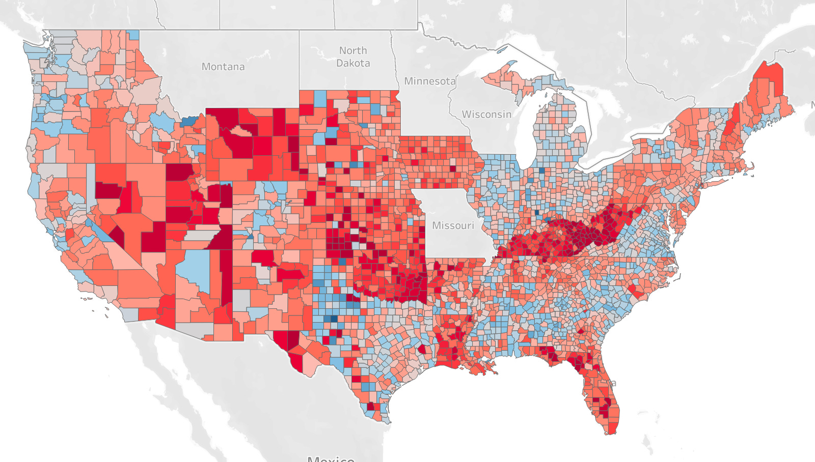
The muted topline differences between the parties mask some big and interesting shifts under the surface, shifts that align well with intuitions about thr current state of the Democratic Party: maxing out their high-propensity voters while suffering disappointing turnout with their lowest propensity voters.
The simplest way to divide “high” and “low” propensity voters is by whether people vote in primaries or not. Nationally, Democratic primary voters outvoted Republican primary voters, 100.9% vs. 100.2% of their expected rates. Because primary voters have about a 9-in-10 chance of turning out to begin with, even small gains above the baseline can signal an especially high rate of enthusiasm. Here is what the map above looks like when we look just at primary voters, representing just over 66 million total votes:
There is a lot more blue here. It’s mostly in areas with lots of “ancestral” Democrats—now including Florida—where we see any red. The Democratic base was excited to vote. But it wasn’t enough.
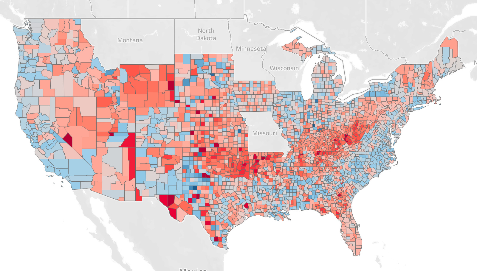
Looking at the people who don’t vote in primaries tells a dramatically different story. Here, registered Democrats voted at just 94.8% of expectations, compared to 100.2% for Republicans. The gap shrunk considerably in the battleground states, with Republicans at 103.8% and Democrats at 101.6%. But outside the battleground states, it ballooned to a 6-point gap — 99.2% for Republicans, 93.1% for Democrats. In fact, the turnout relative to expectations for non-primary Democrats was lower than those with no party affiliation whatsoever, typically the least engaged voters.
The map of the party turnout advantage among non-primary voters, by contrast, is a sea of red.
This map is less filled in because many states don’t allow voters to register by party. Where they don’t, we don’t have party data beyond primary vote history.
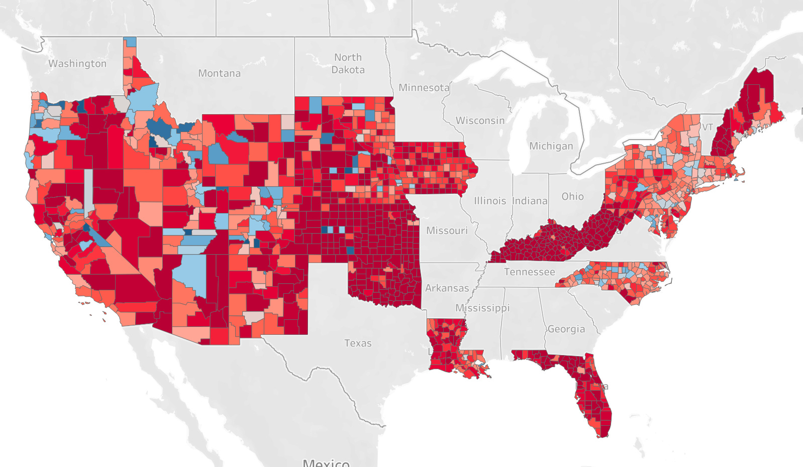
The map above represents a relatively small group—around 15 percent of the electorate. But they’re the tip of the iceberg for a larger group of soft partisans within the 39 percent plurality of 2024 voters with no voter file party. While many will register with no party affiliation, true independents in the electorate are in the single digits. So there is likely a further 30% or so of the electorate with no official party affiliation but who lean towards one party or the other. These maps suggest that Republicans had a turnout edge with them too.
But that isn’t all. The most striking difference comes when you break these groups down demographically.
